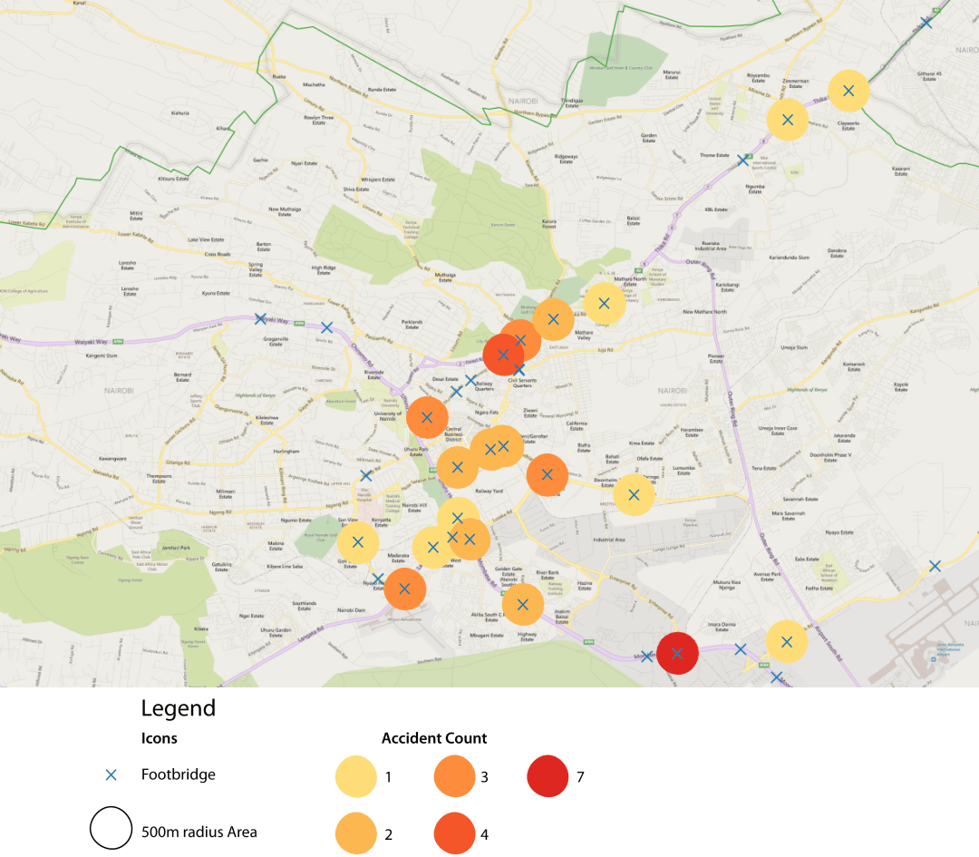
42.5% of accidents involving a pedestrian happened within 500 meters (a distance that takes about 15 minutes to walk) of a footbridge. This would suggest that footbridges are not a complete solution for preventing pedestrian accidents.
42.5% of accidents involving a pedestrian happened within 500 meters (a distance that takes about 15 minutes to walk) of a footbridge. This would suggest that footbridges are not a complete solution for preventing pedestrian accidents.
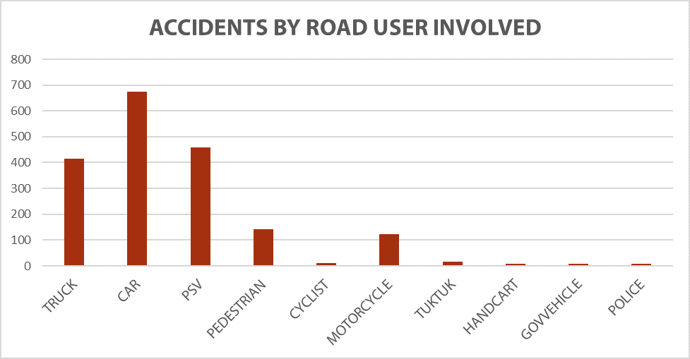
The above graph shows the number accidents involving each type of road users. Note that some accidents involved more than one type of road user and thus could be counted more than once (N=1339).
Although private cars are the type of vehicle most often in an accident, when taking into account the number of people affected by a single accident, PSVs affect the most people because they carry the most. In the graph below a conservative estimate of five passengers is used to demonstrate the comparative effect of PSV accidents versus those involving other road users.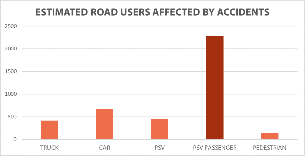
How does the time of day affect accidents? Not surprisingly, accidents follow other traffic patterns. In the morning peak (6 – 9 AM) concentrations are farther out (as everyone is coming into the center of the city), whereas in the evening peak (4 – 9 PM) accidents are more centered near the CBD.
Try turning on layers (one for morning, one for evening) one at a time so you can see the difference.

The above graph shows the total accidents (N=1,900) by the time they were first reported. Two clear peaks are evident during peak commuting (and traffic) hours.
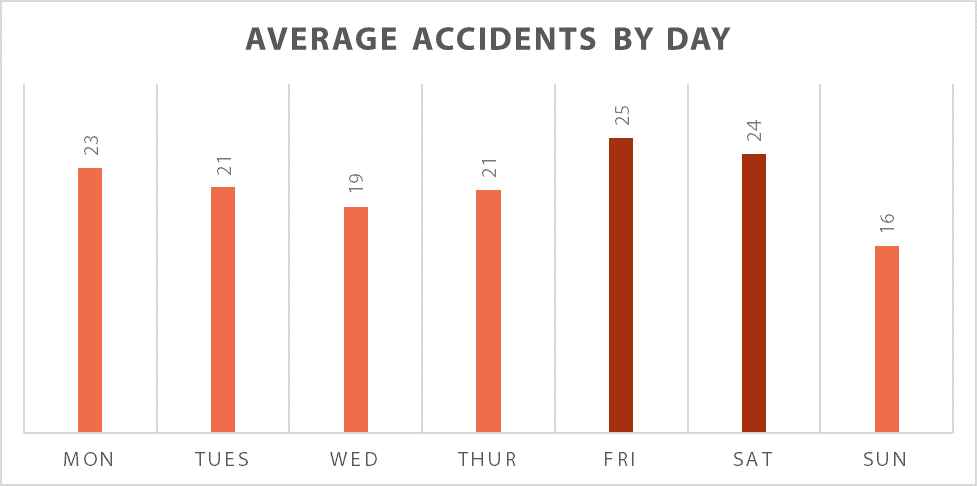
The following graph shows that on average more accidents occur on Fridays and Saturdays.

The graphic above shows all accidents in which a school bus or student was involved. Red icons indicate an accident with suspected fatalities.

PSV (public service vehicles) accidents affect the most people and are reported the more than accidents involving other road users. This map shows all the accidents in Nairobi County that involved a PSV (N = 253). The size of the dot represents the number of reports came in about a specific accident.
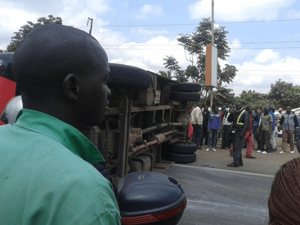
Because a map can obscure the human details of an event such as an accident, let’s look at some of the most reported accidents in more detail.


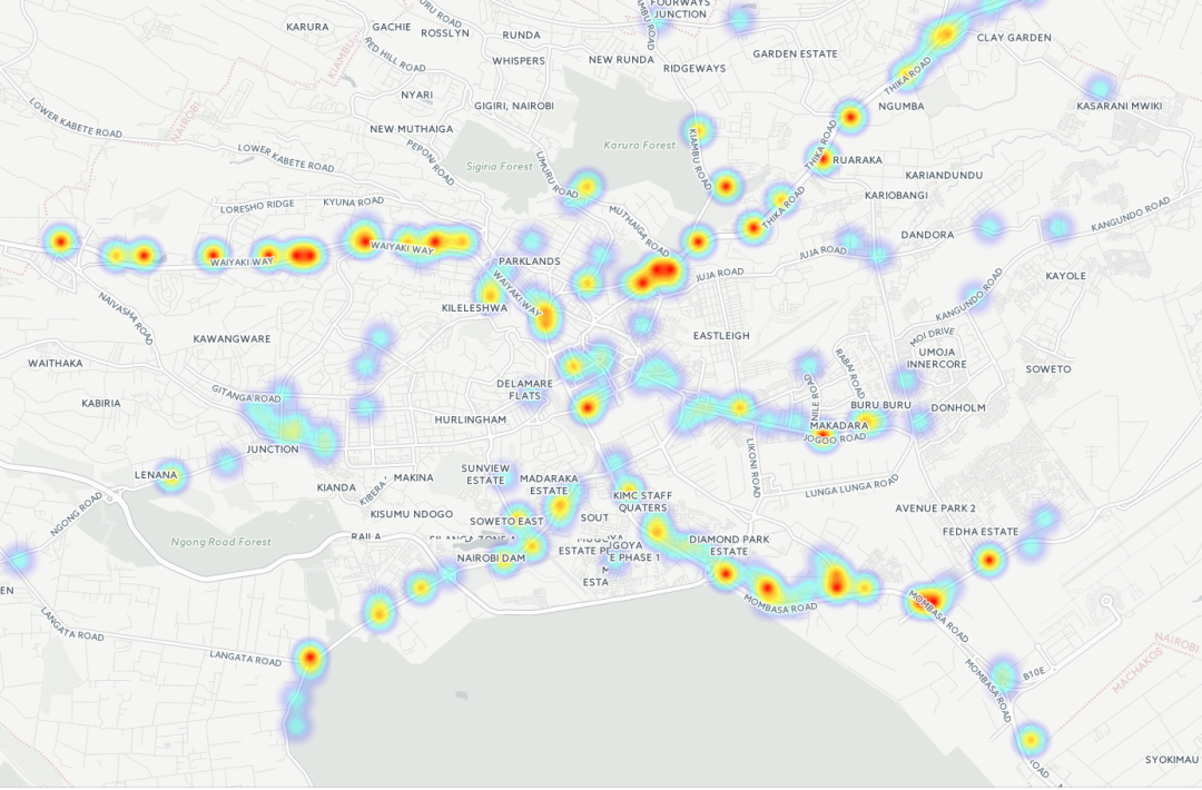
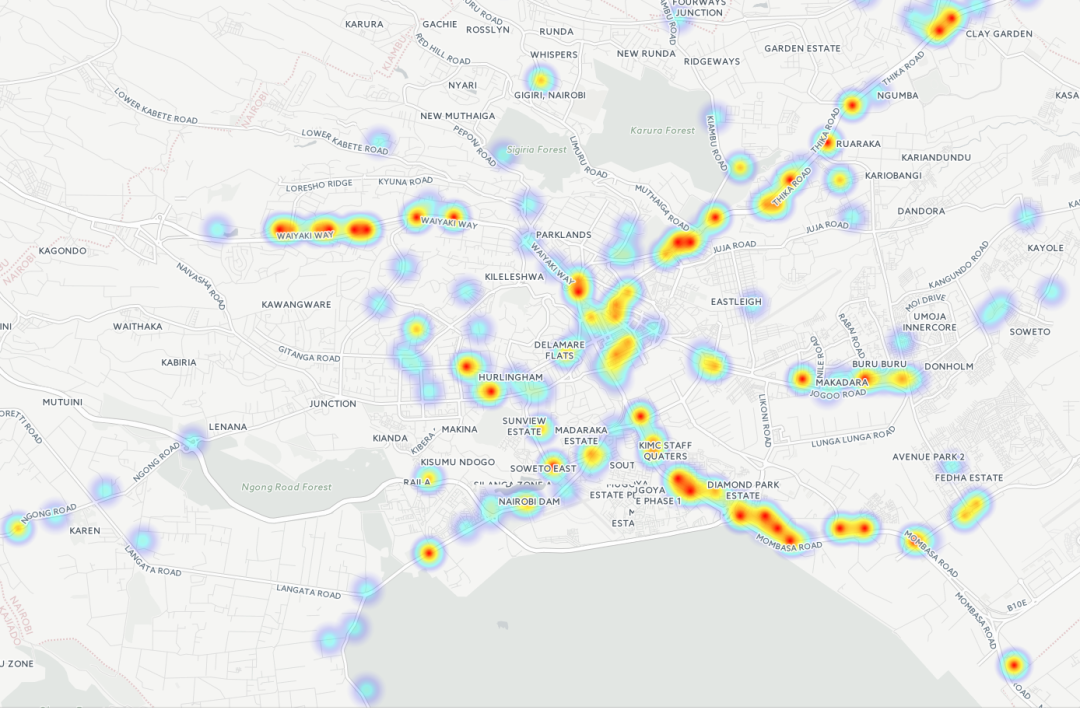
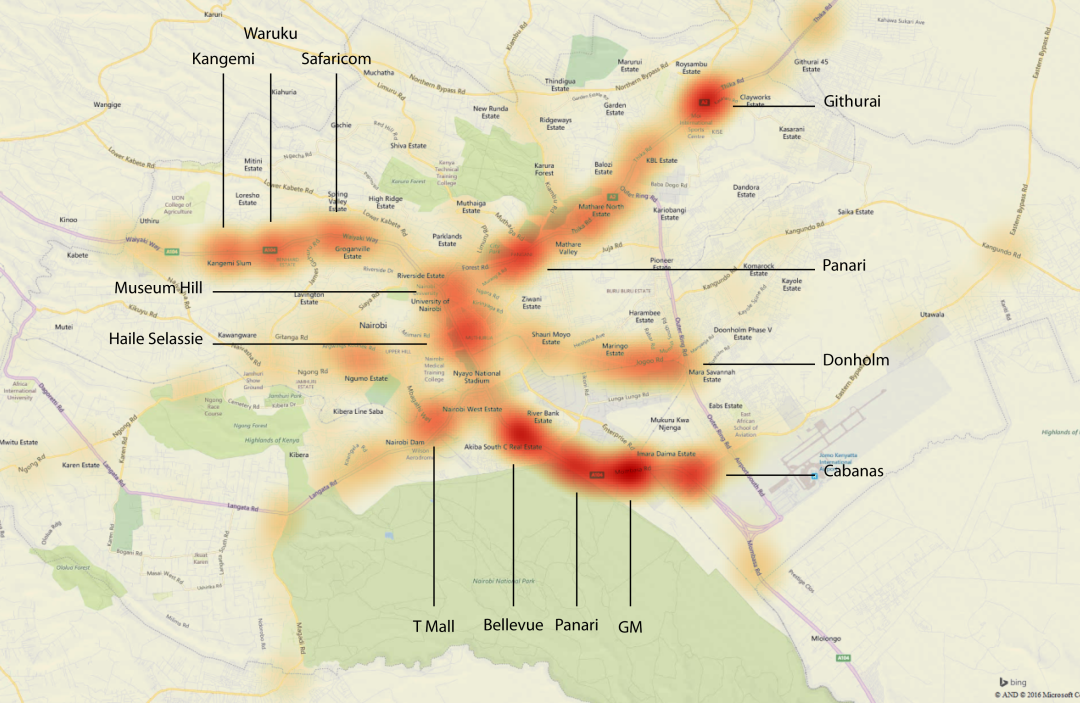 Through this heatmap it is possible to see the major black spots (areas with higher than average accident concentrations) in Nairobi. The darker the area the greater the number of accidents.
This map shows all six months (May 2015 to October 2015) of accidents in Nairobi County. The time-lapse shows accidents by day, with new accidents layering on older ones to finally create a map of all six months of accidents.
This map shows all 1324 accidents in Nairobi County clustered by proximity. Zoom in and out to see more or less detail.
This map shows the density of accidents in Nairobi County. Zoom in to see more detail.
